

Texture First Plain Dye Bedding Ideas: 6 Shop Ready Looks
Tonal layering plus texture is the fastest route to a designer-looking bed, and it works with any plain dye bedding ideas you have in mind. Instead of relying on pattern, you build depth by mixing weaves, finishes and slightly varied shades of one colour family. Premium linen, cotton, mulberry silk, lyocell and bamboo pieces make this approach easy. Below, you’ll find six ready-to-copy looks, the materials that build them, and the exact layering steps to pull them off.
Table of Contents
- Six plain dye bedding ideas to copy for your bedroom
- Choosing materials and finishes for a solid-colour bed
- How to layer a plain dye bed step by step
- Which colour palettes suit your room’s light
- Keeping plain dye bedding looking premium over time
- The plain dye pieces that make up the full set
- Matching plain dye bedding to your bedroom’s decor style
- Adjusting your plain dye bedding through the seasons
- Where to shop for plain dye bedding you’ll actually keep
- Roomie Design’s perspective: why texture leads, not colour
- Shop the look: three plain dye sets worth building around
- Sources
Six plain dye bedding ideas to copy for your bedroom
Solid-colour bedding photographs beautifully when it has depth built in, and the following looks each centre on one focal piece that pulls the eye without adding pattern.
- Sand-washed neutral sanctuary. A pre-washed linen duvet cover in oat or flax, layered over warm oat sheets, with a bouclé lumbar cushion for texture. The linen’s natural crumple gives the bed a lived-in warmth that flat cotton alone can’t match.
- Crisp white hotel fold. A high thread-count percale sheet set with a classic turn-down and no more than three pillows. This is the look hospitality designers reach for when they want the bed to feel expensive and calm at once.
- Muted pastel calm. A matte cotton duvet in pale blue or blush, softened further with a single velvet throw folded at the foot. One plush texture against matte cotton is enough to stop the palette feeling flat.
- Dark contrast, moody bedroom. A charcoal duvet cover against pale, almost-white sheets, finished with a heavily textured throw. The tonal jump between duvet and sheet does the visual work here, not colour variety.
- Two-tone minimalist. Sheets and duvet cover sit within the same colour temperature, but the duvet reads one shade deeper, with contrast delivered through weave rather than hue.
- Textured monochrome. One colour family, several weaves: linen on top, a matelassé coverlet at the foot, waffle-weave pillowcases underneath. Tonal layering like this, using slightly varied depths of the same neutral, is what stops a solid-colour bed looking like a single flat sheet of colour.
If you want a broader set of examples before picking a direction, Roomie Design’s bedding design ideas guide has more layering combinations worth browsing.
Choosing materials and finishes for a solid-colour bed
The fabric you choose does more to shape the finished look than the colour itself. Pre-washed, stonewashed linen gives a relaxed, slightly crumpled texture that keeps solid-colour bedding from reading as clinical; raw, unwashed linen tends to sit stiffer and more formal, which suits a different mood entirely. A percale flat sheet adds a crisp, papery break underneath a softer duvet, while sateen weaves bring a gentle sheen that catches light along the folds. Mulberry silk takes that sheen further, adding drape and a cool touch against the skin, and lyocell delivers a smooth, breathable surface that suits warmer sleepers. Bamboo sits somewhere between cotton and silk in feel, with a slightly cooler hand.
- Matelassé, waffle and ribbed weaves are texture tools, not just finishes. Use one against a smooth layer to build contrast without touching the colour palette.
- Higher thread counts generally fall within a range that brings a denser, softer hand feel and a more substantial drape., which is why they’re the natural choice for anyone building a plain-dye look that reads as premium and lasts well through repeated washing.
- Mixing finishes matters more than mixing colours: a matte linen duvet over a sateen sheet adds depth that a single flat finish never will.
Pro Tip: Lay a swatch of your chosen fabric on the actual bed before buying the full set. Sheen and texture read very differently under bedroom lighting than they do on a screen.
For a deeper look at how texture affects both style and comfort, Roomie Design’s textured bedding guide is worth a read before you commit to a fabric.
How to layer a plain dye bed step by step
Building the look is a matter of sequence, not just selection. Follow this order and the bed composes itself.
- Fitted sheet first, pulled taut with no visible wrinkling at the corners.
- Flat percale sheet next, tucked so it creates a crisp base beneath everything else.
- Duvet cover over the top, positioned so roughly six to eight inches of the flat sheet folds back over it in a clean turn-down.
- Throw at the foot of the bed, chosen in a contrasting weave rather than a contrasting colour.
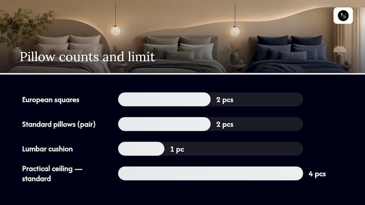
- Pillows last, built in a strict order: one pair of European squares against the headboard, one pair of standard pillows in front, and a single lumbar cushion on top. Four standard pillows is the practical ceiling before a plain-colour bed starts to look cluttered rather than composed.
Steam the duvet cover and sheets once they’re on the bed. It removes packaging creases in seconds and gives the whole set that just-styled crispness you see in showroom photography. Pick one accent piece, whether that’s the lumbar cushion or the throw, and let it carry all the visual interest. Everything else should stay quiet.
Pro Tip: Fold the throw in thirds and drape it slightly off-centre at the foot of the bed. A perfectly symmetrical fold looks staged; a slight offset looks styled.
Roomie Design’s guide on styling bedding for a luxurious look covers additional finishing touches if you want to take this further.
Which colour palettes suit your room’s light
Colour temperature matters as much as the shade itself. A palette that looks flattering in a north-facing bedroom can look washed out in a south-facing one, and vice versa.
- Warm neutrals such as oatmeal, sand and warm greige suit rooms with cooler, dimmer natural light, since they add warmth back into the space.
- Cool neutrals and pale tints, including grey-white and pale blue, work well in brighter, south-facing rooms where the light can carry a cooler palette without feeling cold.
- Two-tone pairing is the safest starting recipe: keep sheets and duvet cover within the same colour temperature, then let the duvet sit one shade deeper than the sheets underneath.
- Sparing accents in mustard, rust or deep green add warmth and personality without disrupting the calm. One deliberate exception, such as a single mustard throw on stone-grey sheets, is enough to stop a plain palette feeling flat.
Testing a swatch against your wall colour before buying is a habit worth building, since light colour temperature in a room changes how a neutral actually reads once it’s on the bed.
Keeping plain dye bedding looking premium over time
Care routines protect both the colour and the texture that make a plain-dye bed look intentional in the first place.
- Wash linen and cotton in cool or warm water with a gentle detergent to protect the dye and reduce fading over repeated cycles.
- Wash silk on a cold, delicate cycle, or have it professionally cleaned, to preserve its drape and sheen.
- Rotate two complete sets and store the spare rolled rather than folded, which keeps the fabric’s natural texture from flattening into permanent crease lines.
- Steam rather than iron where possible, since steaming removes creases without pressing the texture flat.
- Use a mattress and pillow protector underneath everything to extend the life of your top layers.
The plain dye pieces that make up the full set
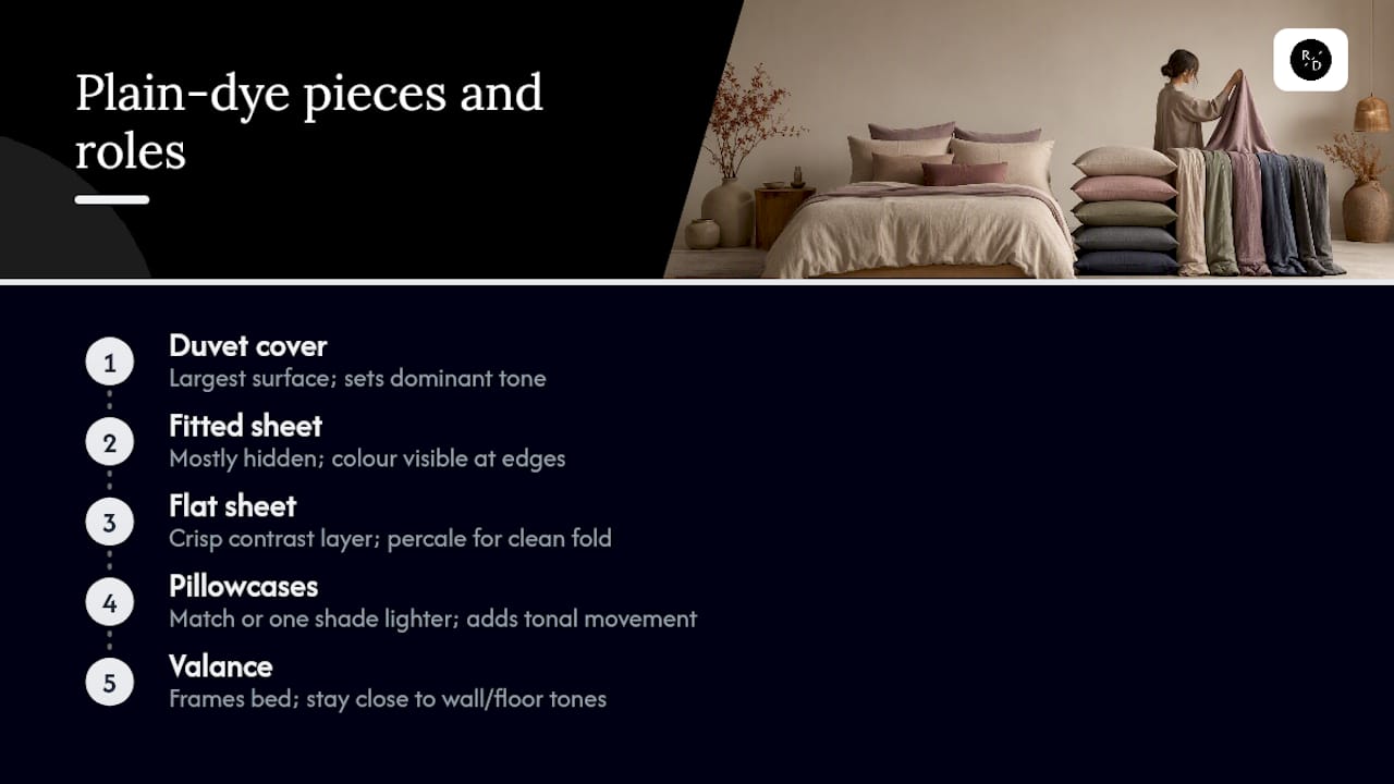
A plain-dye look is built from five product types working together, and each one carries its own styling job. The duvet cover is the largest visual surface and usually sets the dominant tone. The fitted sheet disappears from view but its colour still shows at the edges, so keeping it close in tone to the flat sheet avoids visual clutter. The flat sheet is your crisp contrast layer, ideally in a percale weave for that clean turn-down fold. Pillowcases can either match the duvet exactly for a seamless look or step one shade lighter to add subtle tonal movement across the pillow stack. The valance, where used, should stay close to the wall or flooring tone rather than competing with the bed itself, since its job is to frame the bed rather than draw attention.
Shopping these as a coordinated set rather than piecing them together individually is usually what keeps the tonal relationship consistent, since dye batches can vary slightly between separate purchases. If you’re building your first plain-dye bed from scratch, Roomie Design’s plain dye styling guide walks through how each piece works together in more depth.
Matching plain dye bedding to your bedroom’s decor style
The same solid colour reads completely differently depending on the room around it, so the styling choices should shift with the decor.
In a minimalist bedroom, keep the palette to one or two tones, favour matte finishes over sheen, and stick to the four-pillow ceiling mentioned earlier. Every layer should feel deliberate rather than decorative.
A bohemian bedroom can take more texture play even within a plain-colour scheme: think a heavily textured throw, a chunky knit cushion, and a linen duvet with visible weave, all in earthy, warm tones. The colour stays simple; the textures do the talking.
A modern bedroom suits crisper, cooler palettes and smoother finishes, pairing a sateen or lyocell sheet with a matte duvet cover in charcoal, white or a single cool neutral. Sharp turn-down folds and minimal pillow styling reinforce the architectural feel.
For a full-room finish, pairing your bedding palette with complementary soft furnishings elsewhere in the room, such as a neutral rug underfoot, ties the scheme together without introducing new colours to manage. If you’re drawn to a more sustainable material story within any of these styles, bamboo bedroom styling is worth exploring as an alternative texture base.
Adjusting your plain dye bedding through the seasons
A plain-colour bed adapts easily across the year because the base palette stays fixed while only the weight and texture of individual layers change. In colder months, swap a lightweight cotton throw for something in bouclé or heavy knit, and add a second textured layer such as a waffle-weave coverlet for extra visual and physical warmth. Deeper tones like charcoal, rust or forest green also suit the shorter days, adding richness without needing a pattern change.
In warmer months, lighten the load: swap the heavier throw for a single lightweight linen runner, and let a crisp percale sheet do more of the visual work since it needs no extra layering to look finished. Pale neutrals and cool blues suit this shift particularly well, especially in rooms that get strong afternoon light. Lyocell and bamboo sheets are worth bringing forward in summer for their breathable surface feel, while keeping the same duvet cover colour so the room doesn’t need a full seasonal overhaul.
The easiest way to manage this is to treat your throw and top coverlet as the seasonal variables, and your sheets and duvet cover as the constants. That keeps the core plain-dye palette consistent year round while still letting the bed feel responsive to the season.
Where to shop for plain dye bedding you’ll actually keep
Quality plain-dye bedding sits in a fairly wide price bracket, and the difference usually comes down to fibre and weave rather than colour. Entry-level cotton percale sets tend to sit at the more accessible end, while linen, sateen and mulberry silk sets command a higher price because of the raw material cost and the weight of fabric used. Genuinely premium sets, particularly those in the higher thread-count ranges or in silk, sit toward the top of the market and are usually worth the investment if you want a set that keeps its drape and sheen wash after wash.
A curated plain-dye collection focuses on fibre and finish first, colour second. Shopping from a specialist bedding retailer rather than a general homeware shop tends to give more consistency across matching pieces, since duvet covers, sheets and pillowcases are dyed and woven as coordinated sets rather than separate items. Size guides and customer reviews are worth checking before buying, particularly for fibres like silk and linen where fit and hand-feel vary more than they do with standard cotton.
Roomie Design’s perspective: why texture leads, not colour
Most advice on plain-colour bedding stops at “pick a nice neutral,” which misses the actual problem readers run into: a flat, single-tone bed that looks unfinished no matter how good the colour choice is. The fix has never really been about colour theory. It’s about refusing to let every layer share the same weave and sheen.
A plain dye collection offers linen, mulberry silk, cotton, lyocell and bamboo across curated collections so texture contrast is available from the first purchase, not something you have to hunt for separately. Size guides and customer reviews sit alongside products to help customers choose; fibre and fit matter more to the finished look than the colour swatch. Higher thread-count options are offered for shoppers who want that denser, more substantial hand feel in their base sheets.
If you’re starting from nothing, build outward from a linen base, since it carries the texture on its own, then add one silk or luxe cotton accent piece. That single contrast does more work than a whole set of matching pattern-free pieces ever will.
— Roomie Design
Shop the look: three plain dye sets worth building around
If the sand-washed or two-tone looks above appealed to you, three sets map directly onto them.
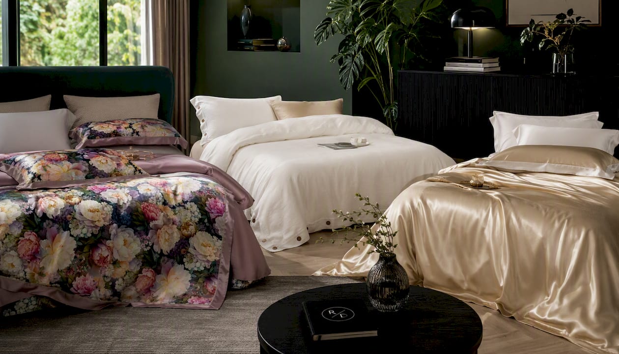
The Misty Bloom Mulberry Silk 22 mm Bedding Set is the pick for the muted pastel calm look. Its drape and gentle sheen give pale blush and blue tones a softness that flat cotton can’t replicate, and it works as the single luxe accent in an otherwise restrained palette. For the crisp hotel fold or textured monochrome direction, the PureComfort™ Luxury Soft Bedding Set delivers a soft, matte hand feel that suits a minimalist aesthetic without any sheen competing for attention. And if the dark contrast, moody bedroom look is the one you keep returning to, the Premium Champagne Mulberry Silk 22 mm Bedding Set brings the high sheen that reads beautifully against a charcoal duvet or pale sheet base.
All three are built to work as the one deliberate exception in an otherwise tonal scheme, rather than competing pieces you need to coordinate around. Browse a full plain dye range and start with whichever base tone matches the room you’re styling.
Sources
- Bed linen ideas for a calm, neutral bedroom
- Minimal bed styling ideas
- Tips for styling a beautiful bed with pure linen
- How to style a bed with solid colour bedding
- 25 minimalist bedding ideas


