

60/30/10 Bedding Color Combinations That Work in 2026
Pick one dominant colour for your duvet or wall, apply it at 60% of the room, add a secondary tone at 30%, and finish with a 10% accent. That single rule, borrowed from the 60‑30‑10 proportion designers use for bedding, solves most colour dilemmas instantly. Short on time? Try hotel neutral, modern organic, or quiet luxury as ready-made starting points, then adjust once you have read the palette breakdown below.
Table of Contents
- Bedding colour ideas organised by mood and style
- How do you choose the right dominant bedding colour?
- Rules for mixing patterns and textures on a bed
- How does room lighting change how bedding colours look?
- Does fabric type change how a colour actually looks?
- What is the best pre-purchase routine for bedding colours?
- Why Roomie Design backs the 60‑30‑10 method
- Shop the palettes: three bedding sets ready to style
- Where this guidance comes from
- Sources
Bedding colour ideas organised by mood and style
Choosing a palette gets easier once you stop thinking in single colours and start thinking in roles. Every well-dressed bed has a dominant fabric, a supporting layer, and a small accent, and the combinations below are built exactly that way.
Neutrals with warmth. A pure white duvet can look clinical under certain lights, so most 2026 palettes soften it with oatmeal, sand, or warm grey shams. Layer a linen throw across the foot of the bed and add taupe or brass accents through cushion piping. This is the “hotel neutral” look, and it works because warm neutrals prevent the sterile feel of stark white bedding, while still reading as fresh and calm.
Warm organic pairings. Terracotta duvet, dusty rose shams, and a woven jute or rattan headboard turn a bedroom into something that feels lived-in rather than staged. Trend reporting for 2026 favours exactly this kind of muted, layered warmth over stark high-contrast schemes, pairing rust with dusty rose or terracotta with sage rather than punchy primary colours.
Cool and calm blues. Marine blue as the dominant, soft grey-blue as the secondary, and a single white or silver accent cushion creates a palette that photographs beautifully and rarely dates. This scheme suits bedrooms with brass or matte black hardware, and it is worth noting that blue tones are among those most frequently recommended for sleep-friendly bedrooms. Roomie Design’s botanical sky blue pillowcase set sits neatly into this palette as the secondary layer.
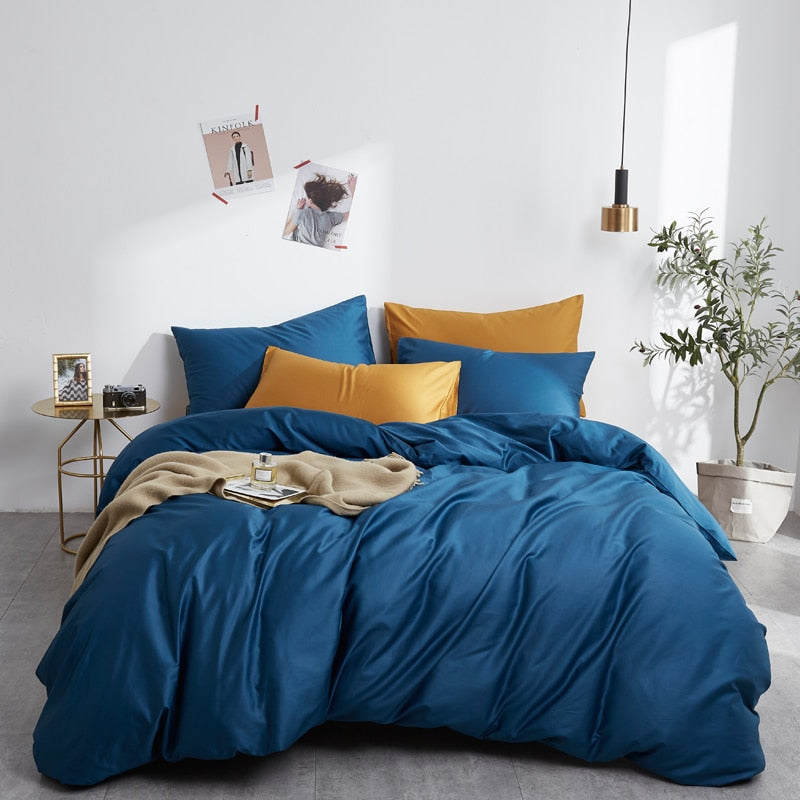
Bold contrast. Navy duvet against a mustard or burnt-orange throw is a combination that rewards confidence. Keep the contrast to two strong colours plus one neutral buffer, such as a cream fitted sheet, so the bed does not tip into visual noise.
Pastel and romantic tones. Blush pink duvet, sage green shams, and a cream ruffled cushion give a bedroom softness without veering twee, particularly when the fabric has a slight sheen to lift the pastel rather than flatten it.
Coastal palettes. Marine blue, driftwood beige, and white rope-style trims echo the calm of a seaside room without resorting to literal nautical motifs. This is one of the strongest matches for a bedroom with plenty of natural light.
Moody and deep tones. Burgundy or forest green as the dominant colour, paired with a charcoal or bronze accent, creates what many designers now call “quiet luxury”: rich, saturated, but restrained rather than theatrical. Higher thread count cottons carry these deep tones particularly well, since the denser weave gives the dye a fuller, more velvety depth without sacrificing breathability.
Here is a quick reference for matching palette to mood:
- Hotel neutral: white or oatmeal duvet, warm grey shams, linen throw, brass accents.
- Modern organic: terracotta or forest green duvet, sage or dusty rose secondary, woven or rattan textures.
- Quiet luxury: burgundy or navy duvet, charcoal secondary, bronze or gold accent cushion.
- Coastal calm: marine blue duvet, driftwood beige secondary, white rope or linen accents.
- Romantic pastel: blush duvet, sage shams, cream trims.
- Bold contrast: navy duvet, mustard throw, cream buffer sheet.
Pro Tip: Photograph your shortlisted palette against your actual headboard before ordering. Colour-blocked beds, where the headboard, sheets, and top layer are coordinated deliberately, read as structured and intentional rather than mismatched, but only when the transition between layers is planned rather than accidental.
For more layered examples, Guides on why colour blocking transforms your bedroom and a roundup of top bedding design ideas both expand on several of these palettes in more detail.
How do you choose the right dominant bedding colour?
Every strong bedding palette starts with one decision: what carries the 60%? That is either your wall colour or your duvet cover, and the choice matters more than most shoppers realise.
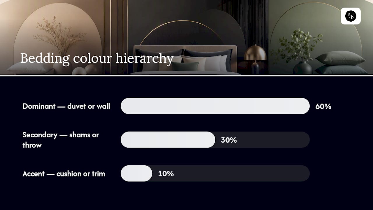
If your walls are already a strong colour, let the duvet be the 30% or even the 10%, echoing the wall tone in a cushion or throw instead of fighting it with an equally loud cover. If your walls are neutral, the duvet becomes your dominant colour and carries the mood of the whole room. This second option gives you more freedom to change the look seasonally, since swapping a duvet cover is far easier than repainting.
Building the set with 60‑30‑10:
- Assign 60% to the dominant, whichever surface, wall or duvet, holds the most visual weight.
- Assign 30% to a secondary tone through pillow shams, a folded throw, or a bed runner.
- Reserve 10% for an accent: a single patterned cushion, a metallic trim, or a contrasting piping detail.
- Check the balance from the doorway. If one colour dominates your eye before you have even looked at the rest of the room, the ratio needs adjusting.
Undertone is the detail that trips up most buyers. Whites and creams are not neutral in the way people assume: some lean warm (ivory, buttermilk) and some lean cool (bright white, dove grey). Matching the undertone of your bedding to the undertone of your wood furniture avoids the subtle clash that happens when a cool-white duvet sits against warm oak, or a cream sheet fights a grey-washed headboard. The colours might look identical on a swatch card, yet feel wrong once they are side by side on the actual furniture.
Before you commit to an order, run this checklist:
- Measure your mattress and check it against the size guide, since duvet proportions vary by region and brand.
- Order a fabric swatch rather than trusting a screen image.
- Hold the swatch against your existing wood tones and wall paint in the room itself.
- Photograph the swatch in daylight and evening light before deciding.
Rules for mixing patterns and textures on a bed
The safest formula is one large-scale print carrying the eye, one or two smaller supporting prints, and solid colours acting as breathing room between them. Design practitioners consistently recommend this large-to-small hierarchy because it stops multiple patterns from competing for attention at once.
A duvet cover with a bold botanical print, paired with a small-scale striped pillowcase and a plain linen sham, follows the rule precisely: the eye lands on the duvet first, then reads the supporting layers as texture rather than competing statements. Layering from a neutral sheet base up to a patterned duvet, then adding accents is the order that photographs best and wears best over time.
Texture matters just as much as pattern, especially in tonal or monochrome schemes where colour alone will not create interest. A cream-on-cream bed can look flat under warm lamp light unless you introduce a linen throw, a knitted cushion, and perhaps a velvet bolster; the contrast in weave does the work that colour contrast would otherwise do. Two to three anchor colours with varied pattern scale and solid-texture breaks is the exact recipe behind the “curated mismatch” look that has largely replaced perfectly matched three-piece sets.
Cushion and throw counts should scale with the bed. A queen or king bed generally carries four to six cushions comfortably; anything smaller starts to look sparse, anything larger tips into clutter.
- One large-print duvet + one small-print pillowcase + one solid sham.
- One solid duvet + two textured cushions (velvet, bouclé) + one patterned lumbar cushion.
- One tonal duvet in a deep colour + a contrasting textured throw + a single patterned accent.
Pro Tip: When in doubt, swap your second pattern for a solid in the same colour family. It almost always looks more intentional than adding a third print.
How does room lighting change how bedding colours look?
A duvet that reads as soft sage under midday daylight can shift towards grey-green under a warm 2700K bedside lamp, and a marine blue can deepen almost to navy after sunset. Testing under both conditions before buying prevents the most common cause of returns: a colour that looked right in a product photo but wrong in the actual room.
Room size changes the calculation too. Light dominant colours make small bedrooms feel more open, while darker bedding adds cosiness to larger rooms; the trick for a small room is keeping the light shade as the dominant and letting a single dark accent, rather than a second large area, carry the drama.
- Photograph your chosen swatch in the morning and again after dark, using only your bedside lamp.
- Hold the fabric swatch directly against your paint chip, not just near it.
- In a small room, lead with a pale dominant and add one darker accent piece.
- In a larger or darker room, a deeper dominant like forest green or burgundy tends to feel intentional rather than heavy.
Does fabric type change how a colour actually looks?
Yes, and this is the detail most colour guides skip entirely. The same dye lot behaves differently depending on what it is woven into. Linen has a naturally slubbed texture that softens and mutes a dye, so a terracotta linen duvet will always look slightly dustier than the same terracotta in cotton. Silk does the opposite: its sheen catches light and intensifies saturation, which is why a navy mulberry silk set reads richer and almost jewel-toned compared with the same shade in a matte weave.
Cotton sits in the middle and tends to render colour closest to true, which is one reason it remains the most reliable fabric for matching a specific palette from a swatch card. Thread count and finish add another layer of depth rather than distortion: higher thread count Egyptian cottons carry colour with a fuller, more luminous quality, giving deep tones like burgundy or forest green a richness that lighter weaves cannot quite achieve, while still feeling soft and breathable against the skin.
- Linen: muted, slightly dusty tone, ideal for warm organic palettes.
- Silk: heightened sheen and saturation, ideal for jewel-toned or quiet-luxury looks.
- Cotton: true-to-swatch colour, dependable for precise colour matching.
- Higher thread count cotton: deeper, more luminous colour with a distinctly premium hand-feel.
Pro Tip: Always test your swatch in the fabric you will actually sleep in. A colour that looks perfect on a glossy silk sample can look noticeably different once translated into the cotton or linen you plan to buy. Roomie Design’s navy mulberry silk bedding set and electric blue silk set both show how sheen shifts the same blue family into two distinct moods.
What is the best pre-purchase routine for bedding colours?
Order swatches before you order the set, then live with them for a few days rather than deciding on the spot.
- Request fabric swatches in your top two or three colour choices.
- Place each swatch against your wall, headboard, and existing throws.
- Photograph the swatches in morning daylight and again under lamp light in the evening.
- Check the undertone against your wood furniture, not just against the wall paint.
- Confirm the size guide, fabric composition, care instructions, and returns policy before checkout.
A simple starter kit removes most of the guesswork: a neutral fitted sheet as your base, one confidently coloured duvet cover, a textured throw, and two accent cushions. That combination alone covers the full 60‑30‑10 structure without a single wasted purchase.
Why Roomie Design backs the 60‑30‑10 method
Curated collections of cotton, silk, linen, and bamboo are offered precisely because fabric changes how colour performs on a bed, not just how it feels. The 60‑30‑10 method and premium weaves are two levers that can keep a palette looking considered for years rather than a single season.
— Roomie Design
Shop the palettes: three bedding sets ready to style
Once you have settled on a direction, the fastest way to test it is against a set built for that exact mood.
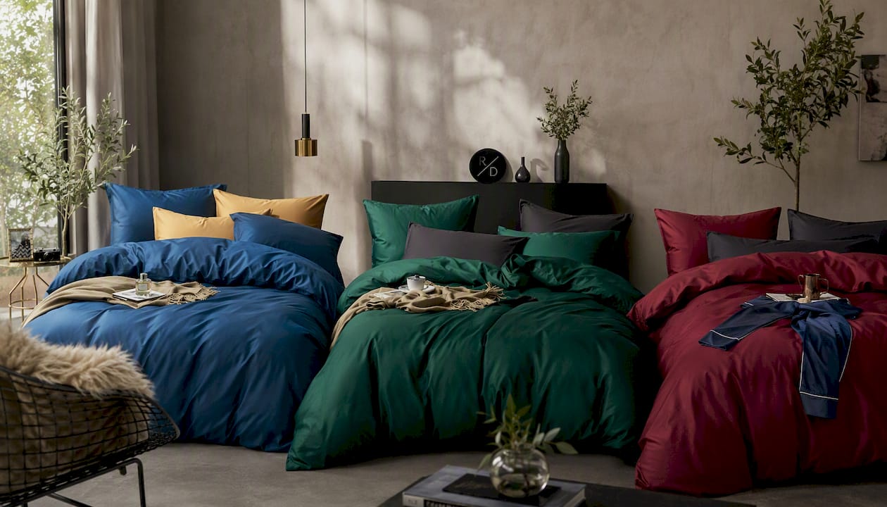
The Core Egyptian Cotton Bedding Set in Marine Blue is the natural pick for coastal and cool-calm palettes: pair it with driftwood beige accents and a single white cushion for the seaside look, or keep it minimal with grey-blue shams for a quieter bedroom. For modern organic and tonal green schemes, the Core Egyptian Cotton Bedding Set in Forest Green carries the depth that rattan, jute, and warm wood furniture ask for, with the owner instruction 0 weave giving the green a rich, almost velvety finish. If your direction is quiet luxury or a deeper jewel-toned bedroom, the Core Egyptian Cotton Bedding Set in Burgundy delivers that saturated, moody dominant colour while remaining soft and breathable night after night.
Order a swatch first if you are choosing between two of these colours, particularly if your bedroom leans towards warm lamp lighting in the evening. Once you are confident in the shade, head to Roomie Design to check sizing against your mattress and complete your order.
Where this guidance comes from
- Architectural Digest: coordinating colours and patterns.
- Trendir: 2026 bedding palette trends.
- One Day Doors & Closets: coordinating interior door colour.
Sources
- Mattress Nut — Bedding color matching guide
- Trendir — 24 bedding colour scheme ideas
- Domino — Bed trend watch 2026: color-blocked beds


